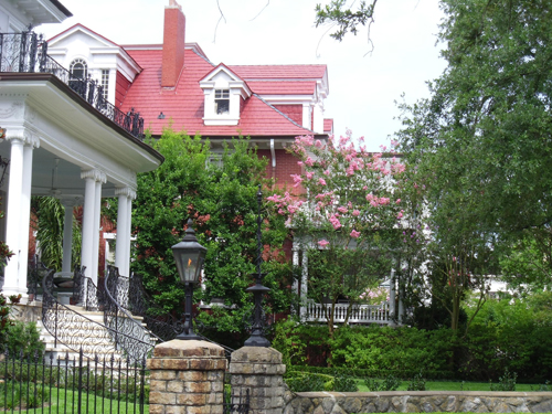
Ideal Neighborhood Character Blends Order, Uniqueness
Last Reviewed: June 23, 2025
Neighborhood character is incredibly important to overall perception of neighborhood quality. We're not going to define this important community development term because you'll catch onto the concept through example, if you're not already familiar with it.
Why is perception of neighborhood quality important? It impacts both
property values and your ability to attract the businesses and residents you want.
In breaking neighborhood character into its component parts, we tried for a top 10 list. But actually, we agree on 13 principles of neighborhood character, a baker's dozen or lagniappe as they would say in Cajun country. We divided these components into two groups: architectural aspects of character, which obviously are difficult for a neighborhood or community to remedy once a "built-out" status has been reached, and another group of elements that can be improved with reasonable investments of money and effort.

Four Architectural Elements of Neighborhood Character
1. A pleasing degree of consistency in urban design and architectural character strikes a balance between repetition and monotony in design elements on a block or in a district.
By design element, we mean general building heights, mass (an architectural term that is similar in meaning to volume in math), setbacks from the street or property line, architectural period, materials, and patterns of doors, windows, rooflines, and building ornamentation. An attractive street certainly includes variation, so those "cookie-cutter" developments where every house is essentially the same don't lend themselves to long-term viability and don't create a positive neighborhood character.
If your area shows a high degree of consistency in a few key elements, but homeowners are starting to make modifications or investors are starting to do tear downs to build McMansions, the neighborhood may be a candidate for some city-enforced design guidelines. This option should be considered in handsome districts, whether modest or opulent. If you feel helpless in thinking about this topic, see our page on urban design principles to get started.
2. Layers of complexity amplify and enhance character. When it looks as though every building in town was built in exactly the same year, that is usually not a good thing.
Even local historic districts of outstanding merit (and some nationally significant ones) actually were constructed in different decades, but new buildings were designed in sympathy with the older buildings until the slight innovations on a basic theme introduced with each era result in a splendid harmony.
3. Attention to scale is critical. In matters of scale, it is difficult to overcome poor judgments on the part of architects or builders. Use zoning to establish some limits. Buildings of many sizes--but not all sizes--actually will work within any town. For example, a large house in a very small town doesn't look odd to us, but a huge discount store in a very small town would be jarring. On a very urban street, we find all sizes of shops intriguing, but if we find a train station that feels like it is about 12 feet square in a major city, something's wrong.
Also consider which scale is most important. Is it scale in relation to the pedestrian, driver, or even the aerial view? Check out our page on urban design theory if you need more help.
We've written a special page on small town character, but most almost everything in the 13 principles applies to villages as well.
4. Vistas and pleasing perspectives are important to the feel of a neighborhood. Think of a vista as what you see from a certain point on the ground. Pleasant vistas are tough to re-create if they have not been considered when placing existing buildings. Vistas in a town or an urban area need termination points, or end points. As new urbanist theory points out, termination points of a view are ideal locations for important public and civic uses.
Of course, Mother Nature provides the termination points of its own in the forms of mountains, horizons, or the ocean or other large body of water. By the way, we all think we have an innate right to view the horizon, so that's one reason for the brouhaha when development intrudes on a former view of the horizon.
Aspects of Neighborhood Character That Can Be Improved Rather Easily
In contrast, a reasonable amount of capital improvement funding or private property improvement can impact some elements of neighborhood character without demolishing buildings or completely altering their exterior elevations.
Relatively low-pain, low-cost components of your neighborhood image include the following.
5. Some creative zing is necessary. Think of "neighborhood character" as close to the concept of "personality." When everything is predictable, even if attractive, it's a little boring. Get inventive.
6. Thoughtful little touches make the difference between boring and spectacular. Your motto should be, "A little thoughtfulness goes a long way," but not to the point that the setting looks artificially perfect. When most small things are right, neighborhood character receives a boost.
This means the street signs are in place, litter has been picked up, trash cans are emptied, sidewalks are present and in good repair, and there are healthy-looking flower tubs in the commercial district. But don't make it look so "arranged" it seems like an intrusion to enter the museum or theme park.
7. Buildings must be in good repair. That doesn't mean that you need to start stripping off 50-year-old stucco so you can apply vinyl siding. It doesn't mean that you replace the aging wood that adds character.
But it does mean using good judgment about which imperfections are charming and which ones only indicate a lack of investment. It also means that if you are in a community dominated by poverty and low property values, you're making the right attempts to shake off fatalism, lift spirits, and find ways to help residents make basic repairs.
8. You need attention to detail in the public realm, which consists of the street, sidewalk, and street lighting, trees, and street furniture. Collectively this is called streetscape when it parallels the street. When the public realm is well-coordinated and unifying, consistency in urban design can be achieved.
Then when the private realm is a trifle quirky, we find it charming rather than obnoxious. It's also worth pointing out that there must be a public realm other than a hardscape (streets or other hard surfaces) to create a welcoming neighborhood character. Plantings of some type soften the rectangular blocks of the other features and provide a bit of unpredictability, seasonal interest, and shade and micro-climate improvements.
Just to add nuance, some of the most delightful places in the world blur the line between public and private space in an intriguing fashion; an example is the courtyards of New Orleans. In such neighborhoods, of course you should encourage homeowners to make their private spaces beautiful, or even provide some technical assistance to help them do so.
9. "Readability" of the landscape and wayfinding need to be superb. While it can be fun to wonder what's around the next corner or curve, it's only a little bit of fun for most people. We want a vaguely familiar set of neighborhood circumstances, a block pattern we can decipher, and a general and somewhat predictable progression from larger to smaller buildings or vice versa.
We enjoy a neighborhood where we can find our way either intuitively or because of attractive wayfinding signs, pavement markings, or art follies with a terrific graphic theme.
10. The visual impacts of pavement, hard surfaces, and utilities need to be mitigated by softening elements. As noted above, usually this means landscaping. However, street banners have become popular in part because they provide some slight movement and a softer texture. Sculpture that features curves and a sense of motion also can help a great deal, even though by definition these are hard surfaces as well.
You won't be able to hide all of your utility lines, traffic control boxes, small cell boxes, and sensors, but you can create so much visual interest that the eyes are diverted to the positive aspects of your streetscape.
11. Pleasant color combinations should predominate. Think through a limited color palette or theme in the public realm and stay with it. If you have mostly gray pavement and beige vinyl, you seriously need punchy colors. But if you have a block face dominated by a pink granite bank façade, you just need a touch of elegance, maybe basic black.
Squint a little while looking at your neighborhood. Is that safety yellow sign too tacky, and if so, can you accomplish the warning in a gentler way? Is every color a boring neutral? Do the colors look appropriate for your climate and part of the country? Is it uninteresting because everything is too well-matched? If you like what you see, keep accentuating the same neighborhood character.
12. Interpretation should make it easy for the visitor to learn about anything particularly unique and individual to your neighborhood character.
If your history is interesting, explain it through interpretive signs, pictographs,
symbols, words, brochures, or living exhibits. If your culture merits
some explaining, take the opportunity to engage the young, the old, and
the visitor with stories. In the process, you may find that you have developed some sustainable tourism. With the addition of QR codes on signs, you can now direct visitors and residents alike to videos and online information that they may want to view on site or digest later. Expect that only one in a hundred visitors will go back and look online after they get home, though, and generally point those QR codes toward quick bits of information.
13. Entrances, gateways, and exits need to be easy to spot. Formal entrances to the neighborhood may or may not consist of monuments, arches, gateways, or signage. But there should be a sense of arrival at a worthwhile destination.
Trees, public art, median strips, colored pavement, banners, or a change of streetscape all could be used to form an entranceway. Just make sure it's welcoming and compatible with neighborhood character.
Frequently overlooked, the exits from the neighborhood also should be easy to find. You never want anyone to leave, of course, but when they do, their last memory of your neighborhood shouldn't be how tricky it was to find the way back to the highway.
Next Steps for Those Interested in Creating Positive Neighborhood Character
- Making and Keeping a Good Community >
- Beautification > Neighborhood Character
Join GOOD COMMUNITY PLUS, which provides you monthly with short features or tips about timely topics for neighborhoods, towns and cities, community organizations, and rural or small town environments. Unsubscribe any time. Give it a try.


